We made a brainstorm, trying to decide on names. It's so hard to decide! Obviously some of these arent serious but still..


We made a brainstorm, trying to decide on names. It's so hard to decide! Obviously some of these arent serious but still..

Our question was about the branding, which another member actually researched however in the evaluation we all had a lot of imput and opinions (which were mostly the same...).
This was Laura's question to lead however we all had input which was important as we had to have a secure brand and so would need to agree on how to market our band.
Here is our question 4 on new technologies
We began to discuss this in an informal group meetnig at a coffee shop, writing down lots of ideas and evaluating the way in which we used our technologies (which you can see below). This question went well, as throughout the project we'd really got to know our equipment and so knew a lot about it.

We had our screening with a variety of people between the ages of 16 and 18 and got some really good feedback which helped with our question 3. We also got feedback from adults and former students. This was my question to lead and I gathered together all the feedback and wrote it up choosing critical and informative feedback.

Heres our q3:
This question also went well, with everything flowing smoothly and everyone having a different piece of feedback to speak about. Splitting the feedback (between good/ bad/ album cover/ myspace) helped to, not only, give people a chance to talk, it allowed us to analyse our feedback critically.

We wont just be handing out questionnaires we will also be asking questions in small groups to get a more personal feel of what people think

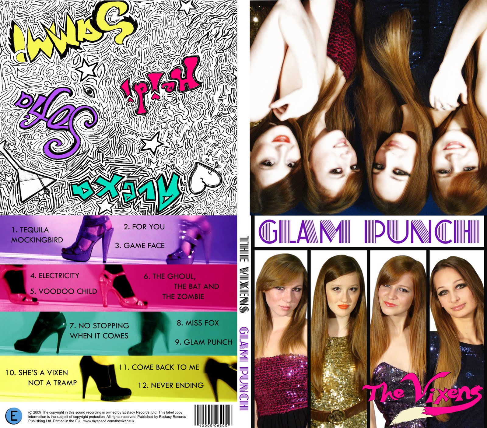
Ok so we've bounced around the idea of having a band called 'someone and the somethings' with the somethings being 'The vixens'
However after hours of dicussions we've settled on purely...THE VIXENS!!
Its snappy and sexy and has an edge showing that we're more of an edgy girl band.
So we had our final (hopefully) shoot today and it went really well, we got all the necessary shots and more. It didn't seem as motivated as the first shoot, but I think everyone was just having a bit of a down day.
Saying that we all took our turn shooting and got some really interesting shots- a success overall
So we had our final (hopefully) shoot today and it went really well, we got all the necessary shots and more. It didn't seem as motivated as the first shoot. Saying that we all took our turn shooting and got some really interesting shots- a success overall. In the narrative we are having Laura lying on a bed, she then looks at the locket and the picture inside of her and her boyfriend (the one we are singing about in the song) and she then goes to the mirror which is where we then 'go into her mind' which is the footage from the studio and us as the sins. For the end of the narrative we shot Laura falling back onto the bed looking happy and slightly more evil than when she started which shows that 'the sins' have corrupted her. Here are some behind the scenes pictures:


We thought we should probably start collecting ideas together for our band name (i.e. come up with a name pronto!)
We thought seeing as Laura is our main girl, but we play such a key role in the video that instead of being a solo singer, or just a group, it would be a fun idea to be '[Someone] and the [Somethings]'
This is quite a retro thing to do, famous in the motown days, but has been revived recently with bands like 'Florence and the Machine'
In the 50s most single artists had a band that would be named in their act when they performed
Johnny Cash and the Tennessee Three
Then in the 60s, Motowns hey-day, most groups were a main artist with their backing vocals.
Martha Reeves and the Vandellas
Diana Ross and the Supremes
Gladis Knight and the Pips
Then in the 80s, other groups, had major success and featured this same name format
Kool & the Gang
Then in more recent times bands have adopted this format again to give a retro, and unique vibe to the band
Florence and the Machine
So we had our shoot this half term. It went really well. We'd made a schedule allowing for any mistakes and managed to not only be on schedule, but ahead of it! We got so many shots, and our costumes looked AMAZING. Thank You to Suzi who came despite a nasty cold to help out with preparations make-up etc. Our group all got on really well without any niggles or arguments; when it came down to it we just had to get on with it and any tension would've made the process just go on for longer. I enjoyed the day so much..We even met Gok Wan!
I hope you like the footage!
In our video we want to do a split screen shot where on the beat we look at each other. This is a picture of what it might look like.

Solid Myspace research, Amelia, but your pertinent notes pale into insignificance when compared to your detailed costume research. There are further guidance questions on the main MV blog, and you should also provide a summary of the main Myspace conventions somewhere on your blog.
I've gathered inspiration for our costume ideas for the deadly sin idea. These aren't things we should wear exactly but we could use them a a basis for our looks. Most of these pictures are from the Metropolitan Costume Institure Gala as it's a night where celebs dress wild and wear wonderful things.
1. Lust
Instead of going down the route that lust=red and passion, we've decided to make lust seem more deadly, giving it a dominatrix feel. These images are the kind of feel we want the look to have (maybe not the one of the leather lingerie...)

I really like the gothic feel of this dress and it's fabulously ott but looks great

OK so this is really just underwear but its leather and dominatrix-y. worn with leggings instead of stockings it would be less provocative but still have the look we are going for.

I like this look of the leggings and blazer. It's got shouilder pads, sequins, it's the kind of the thing we were going for just with better shoes...
2. Envy
Envy and jealousy are seen as green, hence the expression 'green with envy'. Our inspired look will be of course: green, also glamorous and sexy.

This is the famous dress from atonement and it's very graceful and sophisticated. I love the rich green shade but I think our 'envy' should be vamped up a bit.


Some more green...
3. Greed/Glutony
We used Marie Antoinette as the basis for this as she was known for her extravagance and indulgence. We are going to base the look on her, whilst modernising it slightly.

Here's a picture of Kirstin Dunst in the 2006 film Marie Antoinette. I put this picture us to she ideas for the makeup (pale, rouge, red lips..) and the hair.

I think this dress is a modern day version of a marie antoinette/ french renaissance dress. If Ms. Antoinette were still alive today I believe she would have worn this dress.
This video for Girls Alouds 'Can't Speak French' shows the french renaissance inspired look, which looking at this wouldn't be too hard to copy.
4. Wrath
When thinking about rage and anger firey colours such as oranges and reds come to mind. Here's some inspiration I found we may use to inspire our costume for wrath

This dress is really beautiful. I really like the details of the corset. However I think it's too elegant and 'happy' looking.

I like how this dress it really structured and plastic-y.

This is a bit weird but I kind of like it. The crazy pattern and the hints of red and orange work well for our theme of rage.
Here are just a selection of outfits/items of clothing i had found in my wadrobe that might work for one or two of our looks.


A: Look at a selection of album covers (minimum of ten, CD or vinyl), maybe from your own, your parents or a friends collection, or online - the more variety in genre, style, decade etc the better. Make notes in answer to the questions below:
1. What are the typical features that an album cover has? Make a list of all the elements they have in common.
2. How would you categorise the covers in front of you? Are there any other ways of distinguishing between them other than generically?
3. Album covers serve many different functions. What do you think these are (ie what is their purpose?)
B:Choose one album cover out of your selection. It might be a particular favourite, or one that is particularly visually interesting. Prepare deconstruction notes of the cover (back, front, inside sleeve).
Coldplay - A Rush of Blood to the Head 

A Rush of Blood to the Head was Coldplay's second studio album released on 26 August 2002 This image on the front cover is of half a 3D head and shoulders, on a plain white backgroud placed in the centre. The picture looks really eerie and creepy which shows Coldplay's unconventionality.
The cover art was designed by photographer Sølve Sundsbø and has quite an interesting story.
"Sundsbø had been hired by fashion magazine Dazed & Confused in the late 1990s to produce something with a "technological feel, something all white". As an artist, he tried to do "stuff that hasn't been done before, which is virtually impossible"; he suggested taking shots using a three-dimensional scanning machine.
The model for the shot wore an all-white makeup because it produces the "best results"; however, for the image, the model also wore a twill-coloured cape. The computer could not read the colours so it was replaced with spikes, and the head in the image was chopped because the machine only scanned 30 centimetres. The editor of the magazine liked the image and eventually featured it in one of their publications.
Martin saw the image in the magazine and approached Sundsbø for permission to use the image as the cover of A Rush of Blood to the Head. For the album's singles, Martin asked Sundsbø what he could do; the latter suggested scanning the head of each member of the band "
The red writing for the album title stands out and so highlights it to promote the new album. However the writing is down the left hand side so as not to distract from the interesting and abstract image. On the back the name of the album and the band name is down both sides of the album, with the picture and track names in the middle. I can't make any definate connections between the images and the text but you could say that it is ironic that the title is 'a rush of blood to the head' and the image has only a fraction of a head.
The band's genre is described as 'alternative rock' and so their look and branding must reflect this as well. This is why they haven't gone for a mainstream look of a picture of the band etc.
http://www.youtube.com/watch?v=xB7pQpNx-F4
1. Institutional/ reference info
-Which video are you analysing, who is it by, and who directed it.
Fighter- Christina Aquilera.
Directed by Floria Sigismondi
-What genre does the music belong to and what broad characteristics of that genre does the video have?
Genre- pop rock
" Pop rock is a mix of pop music and rock music utilizing a catchy pop style with light lyrics, and (typically) guitar-based songs. There are varying definitions of the term, ranging from a slower and mellower form of rock music to a subgenre of pop music"
It uses her pop image but her rough voice and guitar/drums emphasise the 'rock' element. Dave Navarro (who played guitar for Red Hot Chilli Peppers) co-wrote and played guitar for the song.
2. What is the relationship between lyrics and visuals?
-she's talking about being stronger and she appears 'strong' by throwing things and smashing thigns. Other people around her are collapsing and she is continues to fight through alpl the bad things that are happenening to her in the video. The song is about the guy messing with her head trying to put her down and there are point where the camera shakes showing his words messing with her and she holds and shakes it to get rid of his words, showing they're not affecting him. Mostly the lyrics are amplified and at times just dont fit at all. There's a bit where she's stuck to the wall and trying to escape which fit with the lyrics of the chorus. When you look into it and find out that it was written about her ex-manager it makes much more sense.
" Makes me that much stronger
Makes me work a little bit harder "
" Cause if it wasn't for all of your torture
I wouldn't know how to be this way now and never back down
So I wanna say thank you "
wikipedia says: "Aguilera tosses aside her kimono after furiously removing the pins on her back and throwing them away. A tattered, white, moth-covered dress is revealed, symbolising her metaphoric evolution from a larva to a pupa. In addition, her hair becomes white, and moths fly on to her." --->This shows her transformation from pop-princess to serious artist.
3. What is the relationship between music and visuals
The song is cut and edited to the beat with edgy angles and shakes
There are no solo instrumental bits because it is more about promoting her. However if you listen to the song on the album there are long instrumentals in the middle and at the end.
The video doesn't change the pace of the song, but makes it seem much more creepy and twisted with shakey camera work and the weird costumes. If you listen only to the music appart form the ochestral music at the beginning, it sounds like a rock song and so the video doesn't reflect this.
4. Are there close-ups of the artist and star image motifs?
There are loads of CU's of Xtina but most don't fit with her previous image. Her record company are trying to re-invent her as a big important artist rather than just a pop star. The Stripped album which this song is taken from is Xtina reinventing herself and so all the videos she looks different but the first song of the album Dirrty marked the change for her.
5. Is there reference to the notion of looking?
Yes, there are lots of scopophilic shots of not only her but the other dancers. This song (unlike some of her others) seems less sexual however and more about empowerment. The costumes are not overly sexual, more really weird and quirky.
This music video is performance and concept based-a very even balance. The concept being the look and her performance being part of that.

http://www.girlsaloud.co.uk/site.php
The girls aloud website is really informative giving the fans loads of information about songs and what the band is up to. On the home page there is a MS picture of the band and a video message of their most current album and their tour. There are articles about their tour and how it went, as well as info about the 'year out' that they're taking and Cheryl's solo career. There isn't a colour scheme as such but the overall style is simple, grey with the flash of colour being their outfits. You can easily tell their genre is pop from the outfits they wear and the 'fun' theme of the website.
The links at the top to other pages read: Home, The Girls, gallery, diary, GA style, chat, music and videos, GA Club, shop, mobile, GA Games, sign up. If you sign up to the GA club you're gven exclusive access to images and other things.

Her website is very plain and sophisticated looking with one simple MCU image of her in white contrasting on a black background. The black shows she is aiming at an older audience which fits with her old-school jazzy songs. Not only is it really stylised its really informative giving all gig dates, news; which includes website updates and anything that Duffy has been up to.
There is also a forum where fans can have discussions about her latest songs and what fans think. There is institutional info at the bottom which tells us she is on the universal label, as well as rough trade. There is an audio player at the top of every page so you can listen to her music, with a different song being played on every page.
Mika
The website goes with his flamboyant personality. It's very bright and purple with a oclourful graphic at the top. The graphic is like a theme park or like out of space. The blue arch at the top stands out and draws you in toall the links hich give you extra info about Mika. you can spin it arount to see all the links which makes the website seem more fun and interactive. It kind of reminds me of a crazy pinball machine. There is a link to his facebook and twitter to make the fans feel connected.
Paid for/subscription Products:
2. Who is frukt uk and what is their mission statement/company ethos?
Frukt UK is an agency specialising in music marketin.
"We’re all about music and are really very fond of it. Music colours people’s everyday lives. It’s found in the mundane and the exalted. It moves us all. And it’s thriving. We help brands access the passion and the communities, the lifestyle and the artists. Music is a vast cultural space - it's flexible, it's multi-channel, it's live and digital, it unites gender, race and age and it defines the spirit of generations.You just need to know how to use it. "
"We bring communication ideas to life through music and aim to produce work that is creatively bold and distinct. Either we develop the central idea ourselves and bring it to life with our team of on and offline activation specialists, or work collaboratively with other agencies, using music to make their ideas shine."
1. Summarise the changing image of the band/artist as it has developed over time. It might also be useful to summarise the music genre also. 2. Who are the fans? Do you have any sense of how the music companies have segmented the audiences? To what extent has the branding of a band been linked to target audience? With her first album, "Alright Still" her songs were happy and upbeat, w Lily Alle
When Lily Allen first came on the scene, her image was quite unique for the time. She usually wore "urban" clothes such as trainers and gold bling, mixed with long pretty (prom-like) dresses; an unusual mix. Over the years she has experimented with her style trying at times to seem more sophisticated, or more elaborate and creative, perhaps to fit in with newer artists who are extremely visual with their look such as Lady Gaga or Katie Perry. However her signature hairstyle has barely changed from long straight black hair with a straight fringe. She went blonde for a bit, even pink for a while, and cut her hair into a classy bob, but she went back to her original look for familiarity because it is part of her brand image. Part of her brand image is the fact that she is able to satirise herself, making her seem likeable. She dresses in funny costumes, showing her audience that she isn't serious. The main genre of her music is pop, however that can be broken down into "urban-pop", "ska", "electro pop" and "pop rock".
 ith "smile" being her first hit. Her audience was mainly made up of young fans, appealing to a certain group of people by using London as part of her brand image. This not only appealed to Londoners, but also to people who want to visit London. Her most recent album, "It's Not Me, It's You", is more sex-orientated, showing that the record label want to expand their target audience to older people. She is trying to draw on her life experiences that aren't always happy, shown by the song "The Fear".3. What marketing strategies can you identify? What kinds of strategies can you list? (above/below-the line? unexpected promo stunts? etc). List any examples of the use of synergy with other industries to promote other media/products in connection with a band/artist.
 n uses the myspace music facility to target young tech-savvy fans, and other social-networkers, as well as tweeting on Twitter, keeping her fans updated by an informal personal connection. She has got her own jewellery collection coming out later this year, which she says is based on Chanel jewellery. This links with her connection to Karl Lagerfeld and the fact that she was in a Chanel advert earlier this year. Lily Allen has been signed up as the new brand ambassador to promote the new Braun Satin Hair range of styling products. She is promoting Braun’s new satinliner, satinstyler and satinpro products. As part of her role as brand ambassador, Allen is performing
  a special gig to celebrate the launch. No advertising campaigns are planned as yet. Allen said: “I love playing around with different looks and hairstyles and that’s why I wanted to get involved with Braun.” She partnered with fashion retailer New Look earlier this year to launch the ‘Lily Loves’ clothing range. Lily Allen's single "The Fear" is being promoted via a viral music game.4. Add any relevant links to your blog, especially Myspace page/music vids/official websites etc. A couple of illustrations (e.g key web design graphics/album cover photography) would also be useful to add to your blogs.
Now that we've chosen our song, I started to think about make-up and styling ideas (as this is my area of expertise...)


